Rise Above: Fundraiser
⏀
Objective + Solution
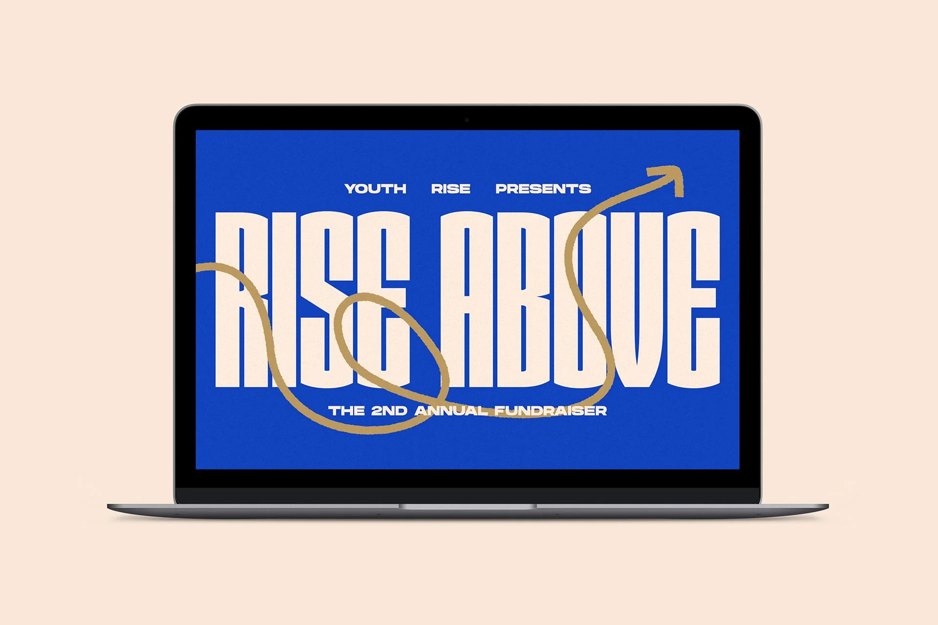
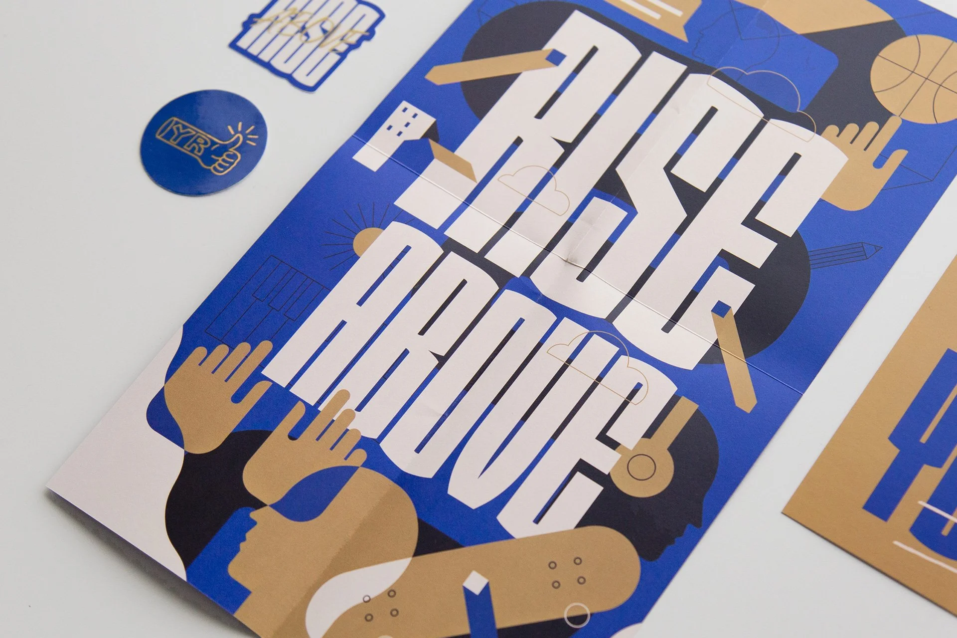
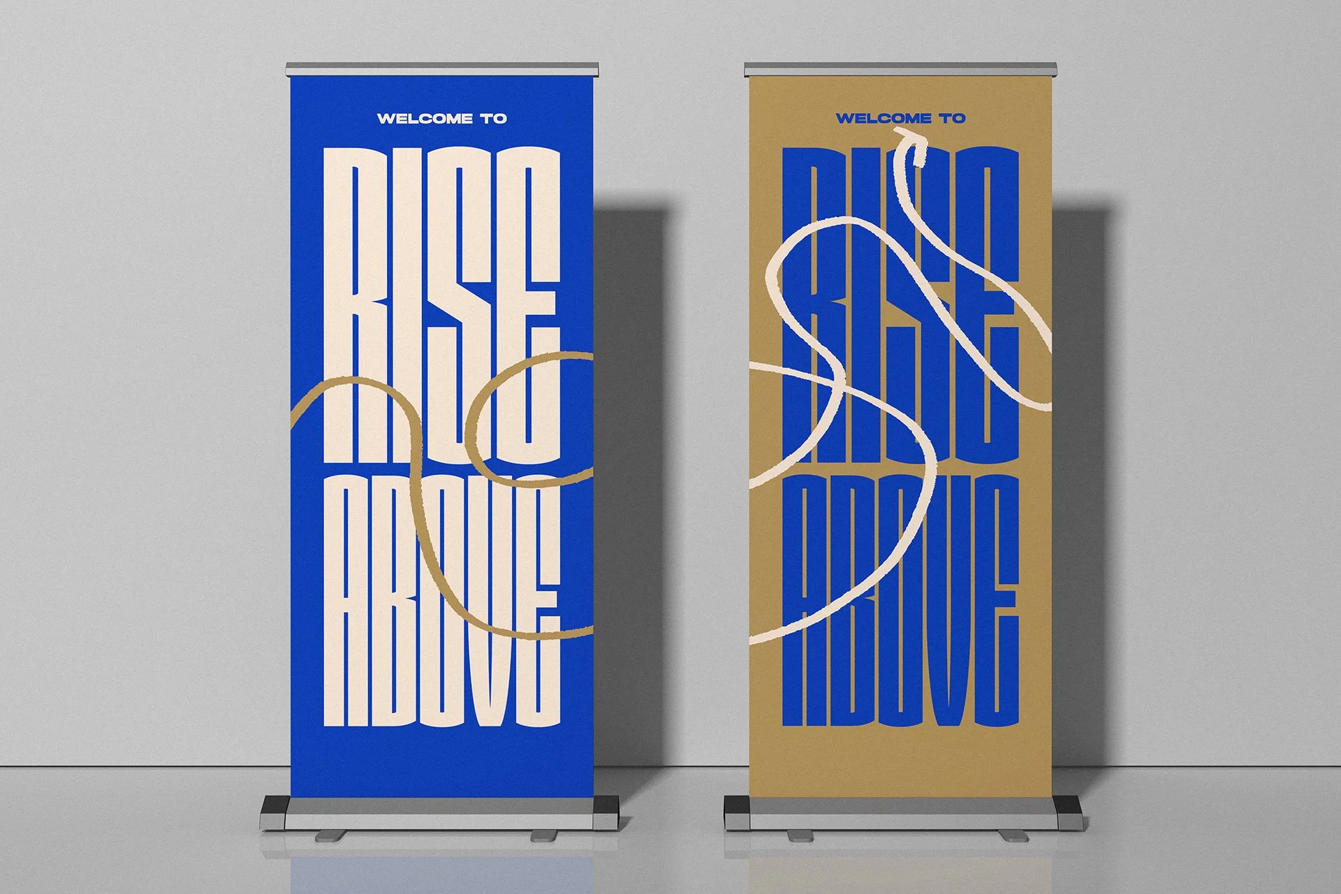
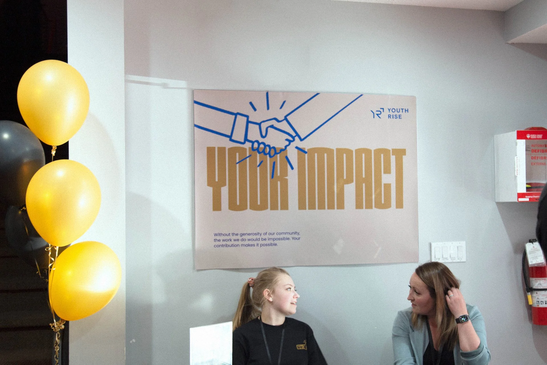
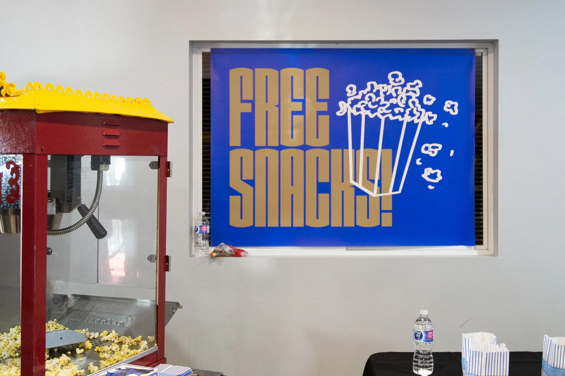
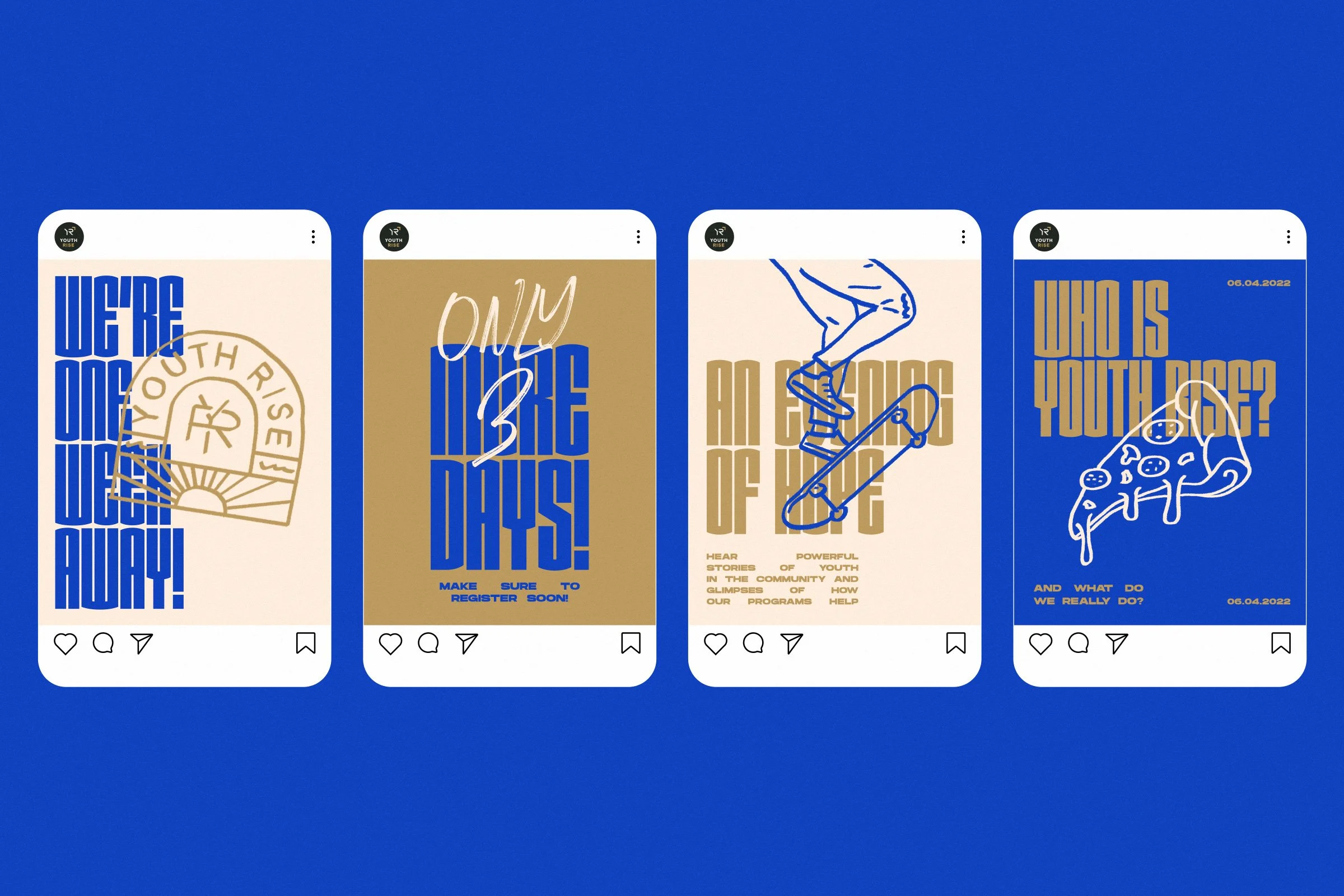
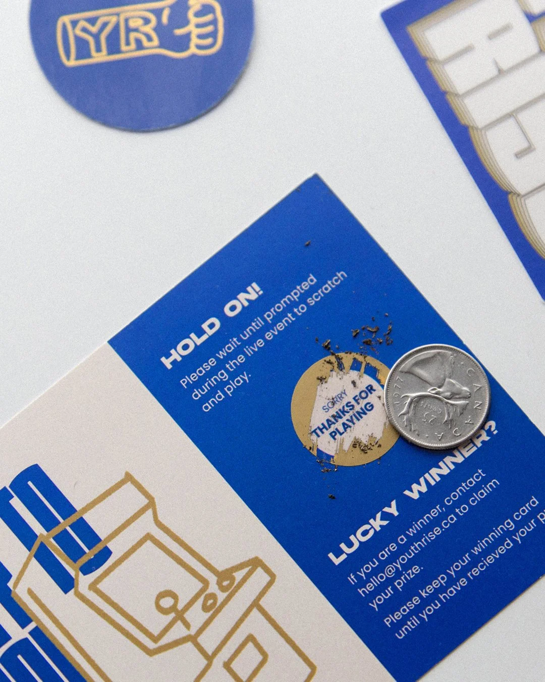
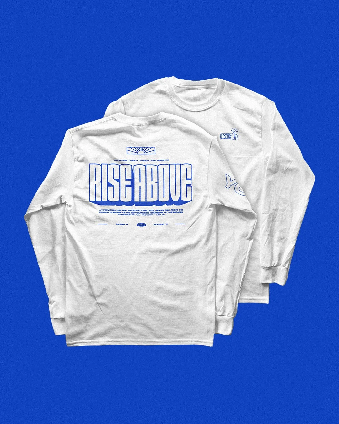
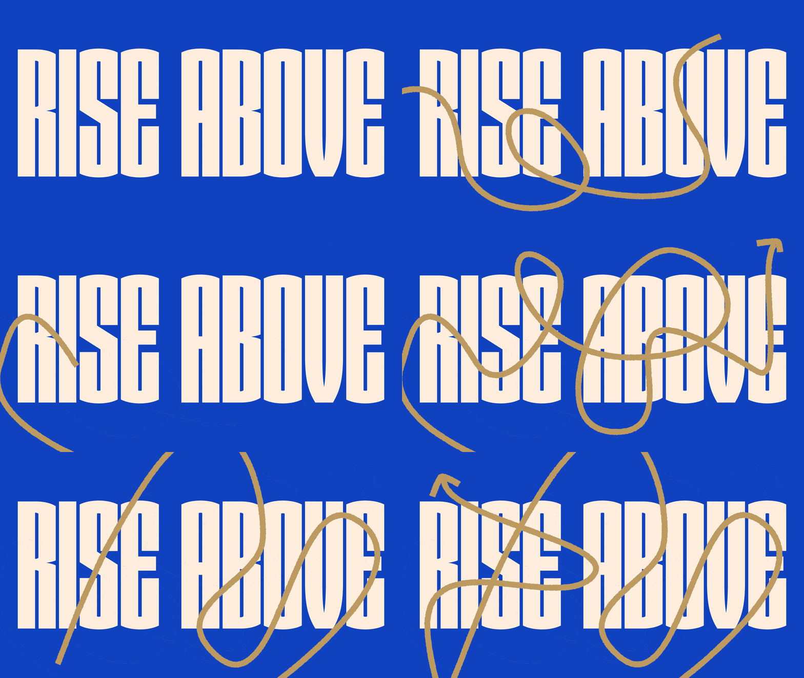
In order to lay the foundation for the language of Youth Rise, we appropriately named their 2nd annual fundraiser 'Rise Above'. Their decision to provide both an online and in-person experience was carefully considered, as they understood the importance of effectively conveying their message. To accomplish this, we created a visual language utilizing a kinetic condensed typeface, accompanied by a series of scribbled arrows and illustrations. These elements were deliberately chosen to serve as a reminder to their donors that every young individual's journey is unique. With their generous support, they can empower these youths to overcome their circumstances and unlock their potential for success.
SERVICES
Visual Identity
Creative Direction
Motion Graphics
Illustration
Social Media
Print Collateral
Merch + Apparel
Microsite


